|
|||||||
| Sigs and Graphics Show off your sigs/graphics or request your own |
 |
|
|
Thread Tools | Search this Thread | Display Modes |
|
#2
 12-21-2005, 10:08 AM
|
||
|
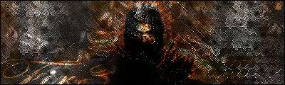
wayyyy to dark

|
|
|
#3
12-21-2005, 10:39 AM
|
||
|
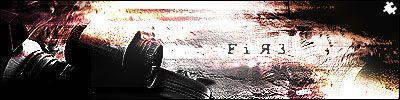
well 1st u screwed up the render. 2nd great job 3rd. the bg feels a lil plain imo.
__________________
#Current:: 
|
|
|
| Currently Active Users Viewing This Thread: 1 (0 members and 1 guests) | |
|
|


 Linear Mode

