|
|||||||
| Sigs and Graphics Show off your sigs/graphics or request your own |
 |
|
|
Thread Tools | Search this Thread | Display Modes |
|
#1
|
||
|
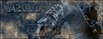
another one
this took me a while so be nice
C&C plz 
__________________
#Current:: 
Last edited by the Medic™; 05-16-2005 at 10:39 AM. |
|
|
#2
|
||
|
Put a border around it

|
|
|
#3
|
||
|
there
__________________
#Current:: 
|
|
|
#4
|
||
|
One more step: put the border on the top layer. Notice how your nazgul actually covers parts of your border- that's not good

|
|
|
#5
|
||
|
ohka but otherwise its OK ?
__________________
#Current:: 
|
|
|
#6
|
||
|
Well, the text is iffy, though I'd say your work has definately improved a lot

|
|
|
#7
|
||
|
i dont like the way u've coloured, try using colour balence or:
a) make each brushing layer a differnt colour b) then get out the eraser tool, pick a brush and set the opacity to about 25% c) brush bits around sig until satisfied like my lil tutorial there  , yes u can report it to Goodtutorials.com , yes u can report it to Goodtutorials.com  
|
|
|
#8
|
||
|
i like the text, just blends a bit too much
__________________
|
|
|
#9
|
||
|
umm yeah many people tell me to change collors, but somehow im just happy with one ... ill try making a collorfull one next
 thnx for tips & help evryone thnx for tips & help evryone
__________________
#Current:: 
|
|
 |
| Currently Active Users Viewing This Thread: 1 (0 members and 1 guests) | |
|
|