|
|||||||
| Sigs and Graphics Show off your sigs/graphics or request your own |
 |
|
|
Thread Tools | Search this Thread | Display Modes |
|
#1
|
||
|
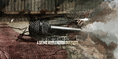
new sig
here it is...
 C&C pls |
|
|
#2
|
||
|
anyone gonna comment?
|
|
|
#3
|
||
|
not sure about the text tbh :/ seems to be the wrong blending mode or something hmm, maybe the font is just too big.
but i think the background is pretty damn nice indeed 
|
|
|
#4
|
||
|
cheers steve
|
|
|
#5
|
||
|
after staring at the piece for a bit....
 bone said.."he didnt like the bright yellow streak in the middle of the piece fix that..make text a little more noticable and youll have a gr8 piece k7  " "
__________________
=====Retired sig team member===== 
|
|
|
#6
|
||
|
I agree out with the yellow bright streak, cuz everything is dull then there is the streak. And the L is barely noticable...Very nice sig though.
__________________
 |
|
 |
| Currently Active Users Viewing This Thread: 1 (0 members and 1 guests) | |
|
|