|
|||||||
| Sigs and Graphics Show off your sigs/graphics or request your own |
 |
|
|
Thread Tools | Search this Thread | Display Modes |
|
#1
 11-21-2004, 05:34 PM
|
|||
|
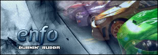
something a little different
tried something a little bit different
 C&C please
__________________
 ---------------------------------------- Quote:

|
||
|
#2
11-21-2004, 05:45 PM
|
||
|
i would animate that text stuff you did
|
|
|
#3
11-21-2004, 07:00 PM
|
|||
|
i think you should take all the text out of it. I think it makes i t look bad. takes out of that great abstract
__________________
 Quote:
|
||
|
#6
11-21-2004, 07:38 PM
|
||
|
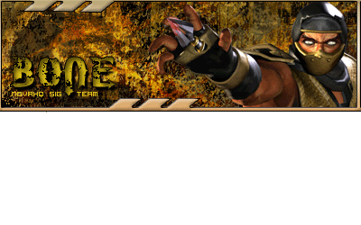
dam i forgot to make a sig for the battle....ill work on it. Nice one but make one line of text apper at a time to make it look better.
|
|
|
| Currently Active Users Viewing This Thread: 1 (0 members and 1 guests) | |
|
|


 < Supporter


 Linear Mode

