|
|||||||
| Sigs and Graphics Show off your sigs/graphics or request your own |
 |
|
|
Thread Tools | Search this Thread | Display Modes |
|
#7
 01-05-2004, 08:08 AM
|
||
|
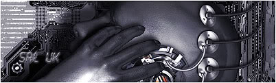
looks cool nightcap


|
|
|
#9
01-05-2004, 11:52 AM
|
||
|
If your just using it here m8, I would change the gray around the edge, As DFHQ uses the same color on each reply, You could mess with the gray and try to get it so it looks like your looking through a hole in the page maybe use a slightly darker gray than DFHQ and edit out all the white around the outside.
It should give it a slight 3D look. But you have done a  m8 m8
__________________
|
|
|
| Currently Active Users Viewing This Thread: 1 (0 members and 1 guests) | |
|
|


 Linear Mode

