|
|||||||
| Sigs and Graphics Show off your sigs/graphics or request your own |
 |
|
|
Thread Tools | Search this Thread | Display Modes |
|
#1
 02-08-2006, 03:07 PM
|
||
|
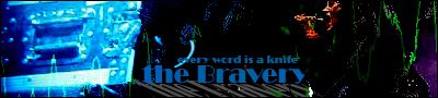
new sig
was playin around, cnc

__________________
#Current:: 

|
|
|
#5
02-08-2006, 05:21 PM
|
||
|
umm...maybe its just me but i think that is the worst sig you've ever made...aside from the text...i do like the text.
imho that the render is horribly blended. dunno why...looks to me like you just took a 35 px eraser and took off the hard edges. ive seen much (much much much) better from ya man. again, this may just be me, because neither living, nor spazz has said any thing about the blending...
__________________
-o l d e s t- 
|
|
|
#7
02-08-2006, 06:54 PM
|
|||
|
hmm i agree with teh r1nG3r about the stock, but i disagree with everyone else about the text. I think it looks fine.
The sig overall looks good 
__________________
 Quote:
|
||
|
#8
02-09-2006, 04:47 AM
|
||
|
aight. tnx for the HONEST opinion!
well heres the wallpaper i used to make the sig, this is imposible to render so i just used it like that. wallpaper: http://img153.imageshack.us/img153/5975/aby0yl.jpg
__________________
#Current::
|
|
|
#10
02-09-2006, 06:27 PM
|
|||
|
Quote:
__________________
|
||
|
| Currently Active Users Viewing This Thread: 1 (0 members and 1 guests) | |
|
|


 Linear Mode

