|
|||||||
| Sigs and Graphics Show off your sigs/graphics or request your own |
 |
|
|
Thread Tools | Search this Thread | Display Modes |
|
#1
 12-26-2004, 02:13 PM
|
|||
|
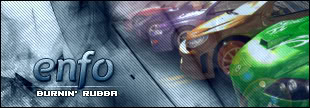
New sig...
wot ya think?
 i kinda like it myself. its kinda lk my old style but i added different brushes and tryed a different technique. and font *thank god they all think*
__________________
 Quote:

|
||
|
| Currently Active Users Viewing This Thread: 1 (0 members and 1 guests) | |
|
|


 Linear Mode

