|
|||||||
| Sigs and Graphics Show off your sigs/graphics or request your own |
 |
|
|
Thread Tools | Search this Thread | Display Modes |
|
#1
 11-05-2004, 03:03 PM
|
||
|
New Sigorz
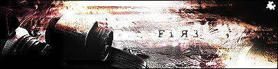
Well....lol yep thats all i have to say about my work..."LOL"
 any comments? erm maybe a rateing?
__________________

|
|
|
#3
11-05-2004, 03:40 PM
|
||
|
on a scale of 1-10 i would say a 8 rating!!!
__________________
ÐÅR€Ð€V¡£=CP= <=CP=> Forums www.phpbbplanet.com/camouflagedp Free PHPBB Forums www.phpbbplanet.com <=CP=> Teamspeak IP 209.190.31.155:5001 Free Teamspeak Server http://www.going-live.com/vb/index.php?  
|
|
|
#4
11-05-2004, 03:46 PM
|
||||
|
Quote:
Take the blur off the right side of the pixel text too 
__________________
Quote:
|
|||
|
#5
11-05-2004, 04:02 PM
|
||
|
lol rgr that, my original intent was to blind enfo when he saw it...hehe

__________________
|
|
|
#11
11-06-2004, 09:06 AM
|
||
|
kk, thanks alot guyz
__________________
|
|
|
| Currently Active Users Viewing This Thread: 1 (0 members and 1 guests) | |
|
|


 Linear Mode

