|
|||||||
| Sigs and Graphics Show off your sigs/graphics or request your own |
 |
|
|
Thread Tools | Search this Thread | Display Modes |
|
#1
 12-15-2005, 05:43 PM
|
|||
|
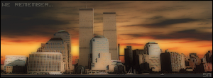
New Banner
It was a quicky (15 mins), but I really like how it turned out.
It was for a compitition for 5000 Gamerender creds (like $32). 
__________________
 Quote:

|
||
|
#6
12-16-2005, 08:53 AM
|
||
|
thats awsomer for 15 mins, but som parts stick out to much, the light & the thing infront of her, hey, thats just me.
really like it otherwise 
__________________
#Current:: 
|
|
|
#10
12-16-2005, 06:00 PM
|
|||
|
thanks alot for the replies.
Yes, the white sticks out because I wanted a defined focal point...but I see where you are coming from. I could tone it down abit and thanks klutch, just set the date and we will tie the knot haha
__________________
Quote:
|
||
|
| Currently Active Users Viewing This Thread: 1 (0 members and 1 guests) | |
|
|
 Similar Threads
|
||||
| Thread | Thread Starter | Forum | Replies | Last Post |
| new banner | slimslim | Sigs and Graphics | 6 | 07-24-2005 09:47 PM |
| Banner | Chels | Sigs and Graphics | 1 | 05-29-2005 09:43 AM |
| banner | the Medic™ | Sigs and Graphics | 14 | 05-24-2005 10:15 AM |
| banner | Stainless | Sigs and Graphics | 5 | 03-29-2004 10:43 AM |
| My first banner | spy | Sigs and Graphics | 3 | 11-25-2003 04:21 PM |


 Linear Mode

