|
|||||||
| Sigs and Graphics Show off your sigs/graphics or request your own |
 |
|
|
Thread Tools | Search this Thread | Display Modes |
|
#4
 03-09-2004, 08:15 PM
|
||||
|
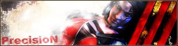
 i dont like it...i dont kno what it is but its not his best work.. i dont like it...i dont kno what it is but its not his best work..
__________________
    Click here for the official member status images!     Quote:

|
|||
|
#6
03-10-2004, 01:15 AM
|
||
|
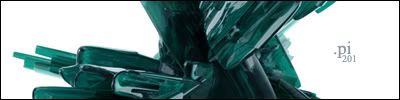
well i like
__________________
If any one wants a life i can email them in .rar and .zip format, although im out of sunlight
|
|
|
#7
03-10-2004, 10:37 AM
|
||
|
its OK in my opinion... did he use some one elses work in that one? cause it looks like he darkened it with some other image... there is an arrow pointing up at the bottom right. Im not here to get people in trouble, i just want to know
__________________
 ^ i cant spell... bower should be bauer... hell with it... Originally posted by blueprint If you weren't so great in bed I'd have to say that's ripping.
|
|
|
#10
03-11-2004, 11:30 AM
|
|||
|
Quote:
__________________
^ i cant spell... bower should be bauer... hell with it... Originally posted by blueprint If you weren't so great in bed I'd have to say that's ripping.
|
||
|
| Currently Active Users Viewing This Thread: 1 (0 members and 1 guests) | |
|
|
 Similar Threads
|
||||
| Thread | Thread Starter | Forum | Replies | Last Post |
| Tt | Construkt | Sigs and Graphics | 8 | 08-16-2005 09:10 AM |


 Linear Mode

