|
|||||||
| Sigs and Graphics Show off your sigs/graphics or request your own |
 |
|
|
Thread Tools | Search this Thread | Display Modes |
|
#2
 01-28-2006, 01:10 PM
|
|||
|
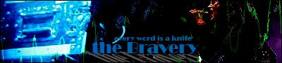
sorry mate, im not really liking this one.
the text is pretty good, but i dont like the background, and the pic could be blended more. hope that helps
__________________
 Quote:

|
||
|
#3
01-28-2006, 01:47 PM
|
||
|
yeh i aint liken it to much either... text looks sweet tho
|
|
|
#4
01-28-2006, 02:35 PM
|
|||
|
the bg color is hideous lol. I don't get the blue either...match the green from the stock to the green from the bg and it would be alot better.
__________________
 Quote:
|
||
|
#8
01-30-2006, 02:38 AM
|
||
|
spend a little more time on it

__________________
#Current:: 
|
|
|
#9
01-30-2006, 02:51 PM
|
||
|
well ner!!
nah ur all right lol. i wasnt 100% on it meself, was trying to play with the colour and see what u all thought. ill try matching it up better next time i feel like playin with ps  cheers guys cheers guys
|
|
|
| Currently Active Users Viewing This Thread: 1 (0 members and 1 guests) | |
|
|


 Linear Mode

