|
|||||||
| Sigs and Graphics Show off your sigs/graphics or request your own |
 |
|
|
Thread Tools | Search this Thread | Display Modes |
|
#1
 05-25-2005, 03:25 PM
|
||
|
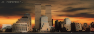
Sig.
this is not something im good at but still i made a try.
grunge: 
__________________
#Current:: 
Last edited by the Medic™; 05-26-2005 at 03:22 AM. 
|
|
|
#3
05-25-2005, 03:35 PM
|
|||
|
Might want to bring up the MEDIC a bit more ... like 3D effect

__________________
                  Quote:
|
||
|
#5
05-26-2005, 03:23 AM
|
||||
|
Quote:
Quote:
okay, sig updated... better ?
__________________
#Current::
|
|||
|
#7
05-26-2005, 11:29 AM
|
||
|
it will kinda ruin the pic, and if i do i have to make some changes and select the right color again..
__________________
#Current::
|
|
|
| Currently Active Users Viewing This Thread: 1 (0 members and 1 guests) | |
|
|


 Linear Mode

