|
|||||||
| Sigs and Graphics Show off your sigs/graphics or request your own |
 |
|
|
Thread Tools | Search this Thread | Display Modes |
|
#1
 02-09-2006, 03:14 PM
|
||
|
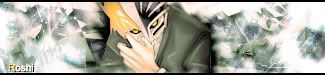
xmen sig
cnc

__________________
#Current:: 

|
|
|
#4
02-09-2006, 04:57 PM
|
||||
|
Quote:
__________________
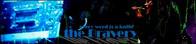
    Somewhere between the Laughing for no reason pointless arguments, long talks, ...<3 and always making fun of each other i fell for you Quote:
|
|||
|
#8
02-09-2006, 06:52 PM
|
|||
|
take out text, and avoid color balance as your main color source. Add some color by hand, like the red in the face. Add it to the background, and it will blend much better.
__________________
 Quote:
|
||
|
#9
02-09-2006, 07:20 PM
|
||
|
hmm my guess would be juggernot ringer
__________________
 ----------------------------------------------  ---------------------------------------------- []==[_'_'_'_'_']=----- <^>(O_o)<^> ----------------------------------------------
|
|
|
#10
02-10-2006, 03:23 AM
|
||
|
i used juggronout .. dunno how its spelled.
also i never use color balance on my sigs, brushed at low opacity. wit the colors of the render that is.
__________________
#Current::
|
|
|
#12
02-10-2006, 04:25 PM
|
||
|
nice sig
__________________

|
|
|
#13
02-11-2006, 12:37 PM
|
||
|
lol klu7ch juggernaut IS xmen. well hes marvel anyway and u know how they used to love mixing the cartoons and comics together...
love the sig med, but i think it would be better without the text
|
|
|
| Currently Active Users Viewing This Thread: 1 (0 members and 1 guests) | |
|
|
 Similar Threads
|
||||
| Thread | Thread Starter | Forum | Replies | Last Post |
| xmen manip. | the Medic™ | Sigs and Graphics | 3 | 11-24-2005 11:27 AM |


 Linear Mode

