|
|||||||
| Sigs and Graphics Show off your sigs/graphics or request your own |
 |
|
|
Thread Tools | Search this Thread | Display Modes |
|
#1
 05-12-2006, 07:27 AM
|
||
|
Teejay
Hey man sorry for the wait, i really stuggled doing a grunge sig for TOol which is highly unlike me, i made you 2 one is really odd but i think it looks droolable and the grunge 1 is poor i dont wanna even post it.
Hope youe like em. used Old art on the odd one and new art kinda on grunge one. 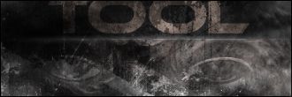  I think i didnt do them justice on the grunge one but the other 1 i feel i did. Here are some other sigs i made while listening to tracks from the new album..(you may have seen them in the other thread). 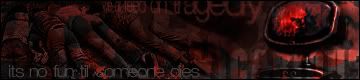  
__________________

|
|
|
#3
05-12-2006, 04:28 PM
|
|||
|
on this one
Take the white/bluish overlay of some sort off of it and leave the colors how they are. I think it will look sick. I like it how it is but i think it will look a little better without it :P. No offense
__________________
 Quote:
|
||
|
#6
05-13-2006, 09:05 PM
|
||
|
Sorry to dissapoint but the sig kinda revolves around that overlay lol without it all the colour goes to poo, i used a background from a previous sig i made that no one wanted and turned it into a tool sig.. i will make you another one

__________________
|
|
|
#7
05-13-2006, 09:15 PM
|
||
|
just lower the blue overlay lol

__________________
 ----------------------------------------------  ---------------------------------------------- []==[_'_'_'_'_']=----- <^>(O_o)<^> ----------------------------------------------
|
|
|
#8
05-13-2006, 09:33 PM
|
|||
|
no dont make me another one, i like it a lot. like roshi said, lower the overlay some if you can, it like takes over the whole sig imo. It seems like it doesnt go with it.
__________________
Quote:
|
||
|
#12
05-15-2006, 06:05 PM
|
||
|
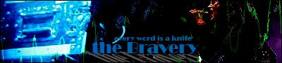
like em all but the grungey one
try to raise the contrast a bit and add some more color, maybe the text towards orange...that's what i would do....nice work anyway
__________________
 I am the bedtime of Reason I am the reason for not to go to bed   Guns for the show, Knives for a pro!!  
|
|
|
#13
05-15-2006, 07:07 PM
|
||
|
u have a great base i would suguest using some curves, levels, and contrasts
stoint btw i pm'ed u
__________________
---------------------------------------------- ---------------------------------------------- []==[_'_'_'_'_']=----- <^>(O_o)<^> ----------------------------------------------
|
|
|
| Currently Active Users Viewing This Thread: 1 (0 members and 1 guests) | |
|
|
 Similar Threads
|
||||
| Thread | Thread Starter | Forum | Replies | Last Post |
| TeeJay | teej | Sigs and Graphics | 16 | 01-18-2005 07:18 PM |


 Linear Mode

