Go Back   Novahq.net Forum > Computers > Sigs and Graphics
FAQ Community Calendar Today's Posts Search

Sigs and Graphics Show off your sigs/graphics or request your own

Reply
 
Thread Tools Search this Thread Display Modes
  #1  
Old 02-05-2005, 12:10 PM
GeeFuss is offline GeeFuss
GeeFuss's Avatar
Cardiac

Join Date: Aug 2004
Posts: 3,862

Abstract


I made a two diff ones...CnC
__________________
Reply With Quote
  #2  
Old 02-05-2005, 12:28 PM
GeeFuss is offline GeeFuss
GeeFuss's Avatar
Cardiac

Join Date: Aug 2004
Posts: 3,862

I actually kinda like the first one better...
__________________
Reply With Quote
  #3  
Old 02-05-2005, 12:55 PM
^Atreyu is offline ^Atreyu
Registered User

Join Date: Nov 2004
Posts: 519

2nd one by far.
__________________


Quote:
Originally posted by Spazz
^Atreyu is the sexiest sig maker alive. Yes, I'm gay for Atreyu.
Reply With Quote
  #4  
Old 02-05-2005, 01:18 PM
Stu is offline Stu
Resident Member

Join Date: Aug 2003
Posts: 3,319

2nd one is best, defently. to make it more "techy/abstracty" remove the drop shadow, and put a 1 pxl border on the text
Reply With Quote
  #5  
Old 02-05-2005, 02:54 PM
Luckz is offline Luckz

Join Date: Jun 2004
Location: Kingston, NY
Posts: 2,360

Send a message via AIM to Luckz Send a message via Yahoo to Luckz
2nd one
__________________
AIM: Luckevolved
MSN: Luckevolvd@hotmail.com


SOTW #1 Winner

Reply With Quote
  #6  
Old 02-05-2005, 03:28 PM
GeeFuss is offline GeeFuss
GeeFuss's Avatar
Cardiac

Join Date: Aug 2004
Posts: 3,862


Or maybe should I just lower the opac of the stroke...cuz I think it looks dumb on it :-/

LOL I love doing this to yall...
__________________
Reply With Quote
  #7  
Old 02-05-2005, 03:57 PM
.ringer. is offline .ringer.
Registered User

Join Date: Feb 2004
Posts: 5,473

make the text better then its all gravy
__________________
-o l d e s t-
Reply With Quote
  #8  
Old 02-06-2005, 02:55 AM
GeeFuss is offline GeeFuss
GeeFuss's Avatar
Cardiac

Join Date: Aug 2004
Posts: 3,862

Umm suggestion for the text?
__________________
Reply With Quote
  #9  
Old 02-06-2005, 09:37 AM
.ringer. is offline .ringer.
Registered User

Join Date: Feb 2004
Posts: 5,473

...make it better...lol


j/k, just get a different pixel text...maybe change the blending mode...
__________________
-o l d e s t-
Reply With Quote
  #10  
Old 02-06-2005, 11:22 AM
Spazz is offline Spazz

Join Date: Dec 2003
Location: Pennsylvania
Posts: 3,378

Send a message via AIM to Spazz
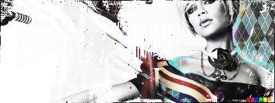
uh...the colors are way to saturated. If you were going for an abstract look why would you fade out the entire....abstract part. You should probably do something with the white you have on top of the render thingies
__________________
Reply With Quote
  #11  
Old 02-06-2005, 08:31 PM
GeeFuss is offline GeeFuss
GeeFuss's Avatar
Cardiac

Join Date: Aug 2004
Posts: 3,862

All I put on there was like 3-5 brushes...then put the like grid on there, then changed the hue of the two sides...not much I did to it...

Well I guess it aint abstract then :-/
__________________
Reply With Quote
  #12  
Old 02-06-2005, 08:36 PM
.janissary is offline .janissary
Registered User

Join Date: Oct 2003
Posts: 464

2nd one on first post...look good
Reply With Quote
Reply


Currently Active Users Viewing This Thread: 1 (0 members and 1 guests)
 

Posting Rules
You may not post new threads
You may not post replies
You may not post attachments
You may not edit your posts

BB code is On
Smilies are On
[IMG] code is On
HTML code is Off

Forum Jump

Similar Threads
Thread Thread Starter Forum Replies Last Post
New abstract. Stu Sigs and Graphics 5 04-16-2005 04:58 AM
new abstract BdD-Ares Sigs and Graphics 15 12-17-2004 09:58 AM
Abstract? Stu Sigs and Graphics 7 12-04-2004 06:37 AM
abstract teej Sigs and Graphics 7 11-24-2004 10:14 AM
abstract? the þrox™ Sigs and Graphics 12 11-01-2004 11:41 AM


All times are GMT -5. The time now is 09:22 AM.


Powered by vBulletin®