|
|||||||
| Sigs and Graphics Show off your sigs/graphics or request your own |
 |
|
|
Thread Tools | Search this Thread | Display Modes |
|
#1
 12-06-2004, 07:15 PM
|
||
|
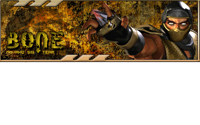
C&C sig
 My newest. As I look at it, I think I should make the border 1px thinner...and there's something else about it that rubs me wrong, but I can't put my finger on it. What do y'all think?
__________________


|
|
|
#3
12-06-2004, 07:46 PM
|
||
|
bud use my dam tut!
Also no matter what color the background is put a 1 px black border. >new layer >Select all >edit >stroke >1 px black (foreground) also put the picture behind the border and put him in the background like in my tut. download "silkscreen" from www.dafont.com and use that as your pixel font. And finally work on the text. Hope this helps, im not trying to be mean, just trying to help a bud out. -con 
|
|
|
#4
12-06-2004, 09:17 PM
|
||
|
Hey, I don't see it as mean, don't worry. I'd rather y'all tell me it looks like **** then tell me it looks good when it really doesn't. Sure, sometimes it hurts, but how am I ever going to get better?
 Of note though, don't tell me it looks like **** then not offer suggestions  Hmm, I'll see what I can come up with...to be continued 
__________________
|
|
|
| Currently Active Users Viewing This Thread: 1 (0 members and 1 guests) | |
|
|
 Similar Threads
|
||||
| Thread | Thread Starter | Forum | Replies | Last Post |
| New sig C&C Please | echoz | Sigs and Graphics | 11 | 01-06-2005 11:05 PM |
| A new sig (C&C) | HauntShade | Sigs and Graphics | 4 | 10-17-2004 06:01 AM |
| ‼¿ùC↑d┐ÑΣùCrÉ3a↨ | teej | Sigs and Graphics | 10 | 08-23-2004 05:07 AM |
| ¿¿,▬B7!oy╞d‼É╞C«{ | teej | Sigs and Graphics | 10 | 08-09-2004 08:03 PM |
| New Sig C&C please | the þrox™ | Sigs and Graphics | 10 | 06-16-2004 12:46 AM |


 Linear Mode

