|
|||||||
| Sigs and Graphics Show off your sigs/graphics or request your own |
 |
|
|
Thread Tools | Search this Thread | Display Modes |
|
#6
 11-07-2004, 04:21 PM
|
||
|
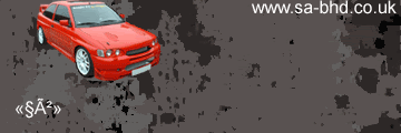
2

|
|
|
#7
11-07-2004, 04:26 PM
|
||
|
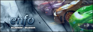
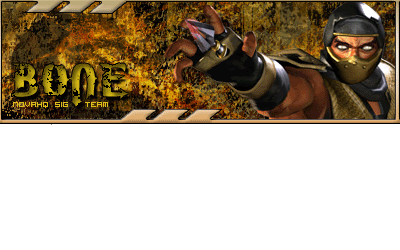
gotta go with 2
__________________
|
|
|
#8
11-07-2004, 09:23 PM
|
||
|
damn i cant see'em, ohh now i can #1
__________________
Insane Silence Destructive Peace Rushing Calm Last edited by Brute Force; 11-08-2004 at 07:18 PM.
|
|
|
#14
11-09-2004, 01:19 AM
|
||
|
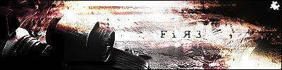
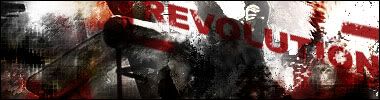
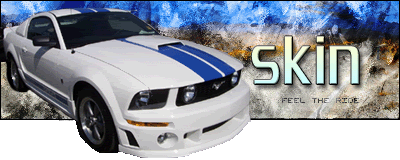
i like the grayscale images but in this case the colour one wins me over
__________________
Insane Silence Destructive Peace Rushing Calm
|
|
|
| Currently Active Users Viewing This Thread: 1 (0 members and 1 guests) | |
|
|


 Linear Mode

