|
|||||||
| Sigs and Graphics Show off your sigs/graphics or request your own |
 |
|
|
Thread Tools | Search this Thread | Display Modes |
|
#1
 12-20-2004, 11:06 AM
|
||
|
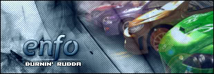
new sig
c n c plz


|
|
|
#2
12-20-2004, 11:29 AM
|
|||
|
in my oppinion, its too big, text dun match (cant read the bottom) and you need to blend the car, erase some of the edges or somefink.
__________________
 Quote:
|
||
|
#4
12-20-2004, 11:32 AM
|
||
|
ahh right ok thnx steve but ss , erase the edges???? wtf! and i did blend it i used the feather thingy
|
|
|
#5
12-20-2004, 11:35 AM
|
||
|
 that better?
|
|
|
#7
12-20-2004, 12:00 PM
|
||
|
it is off...
|
|
|
#8
12-20-2004, 12:02 PM
|
||
|

|
|
|
#10
12-20-2004, 12:14 PM
|
||
|
god dammit someone said its too small, i went the next size up, now ur saying its too big!!
|
|
|
| Currently Active Users Viewing This Thread: 1 (0 members and 1 guests) | |
|
|


 < Supporter

 Linear Mode

