|
|||||||
| Sigs and Graphics Show off your sigs/graphics or request your own |
 |
|
|
Thread Tools | Search this Thread | Display Modes |
|
#2
 03-08-2005, 03:15 PM
|
|||
|
Don't like the line in the middle. The text isn't too good but I like the BG. Although the grunge brushes in the BG could be improved.
__________________
Quote:

|
||
|
#4
03-08-2005, 03:53 PM
|
||
|
I like it except the line and font. Fix that and it's almost perfect

__________________

|
|
|
#8
03-08-2005, 08:03 PM
|
||
|
Yea everything is cool but the font.
__________________
 - Where Your Thoughts Come To An End -
|
|
|
#11
03-09-2005, 09:19 AM
|
|||
|
Quote:

__________________
=====Retired sig team member===== 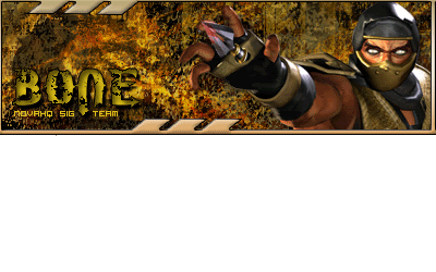
|
||
|
| Currently Active Users Viewing This Thread: 1 (0 members and 1 guests) | |
|
|


 Linear Mode

