|
Sigs and Graphics Show off your sigs/graphics or request your own |
|
Thread Tools | Search this Thread | Display Modes |
#1
|
||
|
another one(s)
more sigs from the non-master:
^^^as u can see, i lost a bit of the effect in this one suggestions? all right, i've made a text change: Last edited by secretx; 01-08-2004 at 07:38 AM. |
#2
|
||
|
maybe a border color change? now that i see them, the borders barely show at all.
and there're some jaggies i thought i smoothened out... |
#3
|
||
|
first one is good. I suggest using a pixel font though
|
#4
|
||
|
quick response, i like it!!
i tried pixel fonts like supermarket, silkscreen, fff access, fixed, org_v1, sw!ft, all of those, cant get one that looks good. Last edited by secretx; 01-07-2004 at 09:15 PM. |
#5
|
||
|
yea border color change and maybe make the font like mirror like blueprints, might add a lil more to the sig. thats just me though
|
#6
|
||
|
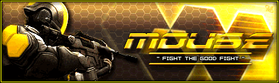
they are not bad.. the bottom one has too much white in it & it hurts my eyes lol. The border needs to be in black, the font isnt that great i agree with blueprint & put a pixel font instead or u can just get a better looking font & add some effect to it here u can download some cool fonts from this web site http://www.1001freefonts.com/
__________________
|
#7
|
|||
|
Quote:
|
#8
|
||
|
squeek !
1. Duplicate text layer.
2. Transform/Flip Vertical. 3. Reposition text. 4. Adjust opacity. |
#9
|
||
|
__________________
|
#10
|
||
|
thanks everybody
|
#11
|
||
|
all right, as per the suggestions of blueprint and fozy and the instruction of mouse, we now have:
|
#12
|
||
|
text looked too small, i made it faux bold:
|
#13
|
||
|
looks nice m8
black border maybe? |
#14
|
||
|
will do.
|
#15
|
||
|
here it is:
|
#16
|
||
|
ooooo yeah
|
#17
|
||
|
looking sweet now
__________________
|
#18
|
||
|
ty guys, couldnt have done it w/o ur input
|
Currently Active Users Viewing This Thread: 1 (0 members and 1 guests) | |
|
|