|
|||||||
| Sigs and Graphics Show off your sigs/graphics or request your own |
 |
|
|
Thread Tools | Search this Thread | Display Modes |
|
#1
 07-20-2009, 11:34 PM
|
|||
|
a little work
Well, not really little. It's actually pretty huge, but it's what I've been working on lately.
for smaller resolutions click below http://www.eleventh-design.com/images/gogeek_logo.png
__________________
Quote:

|
||
|
#2
07-21-2009, 10:22 PM
|
||
|
always amazing edge!
__________________
|
|
|
#3
07-21-2009, 11:43 PM
|
||
|
omg that is really good edge i do mean it!
love how you use the eyes in it and the text as will
__________________
* altnews sources [getmo & others news] not found main FNN: realrawnews.com *Discord: Unknown77#7121 Playing now days: EA Games> swtor [star wars old republic]
|
|
|
#5
07-22-2009, 07:40 AM
|
||
|
I think your type looks great, good choice of font, good kerning, great colorcombo and I love the subtle 3d effect added to it.
I have a problem however with the glasses.. I think you are on to something with the idea, but it isn't working very well right now. There's too much happening at the same place for me to read it well. The reflection in the glass, highlights on the frame, tape and big eyes are just too much information. Try to get rid of some of the details, remember that the most important thing is that 1: I read and remember the name of the company 2: Understand what the company does
|
|
|
#7
07-22-2009, 01:41 PM
|
||||
|
Quote:
99% of logos out there don't convey what a company does unless a slogan is attached. My logo does not convey what my company does and I did not intend on designing it that way. As long as this image sticks to people, they will remember it. Trust me. Say for example you looked at the pepsi logo for the first time - ever. 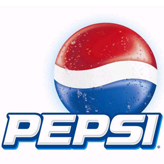 Just by looking at this, would you be able to tell it was a soft drink manufacturer? No, you wouldn't. The object of this logo was to attract the customers eyes to the sphere. It's eye-catching and its colorful.
__________________
Quote:
|
|||
|
#10
07-22-2009, 11:45 PM
|
||||
|
Quote:
__________________
Quote:
|
|||
|
#11
07-23-2009, 07:29 AM
|
|||
|
Quote:
The big comic-like eyes are now your main focal point. Unless go-geek (or is it gogeek or maybe go geek??) are mainly into comicbooks or something like that, your logo is conveying the wrong message, you might just aswell have used comic sans as the font.. There's no reason to go all arrogant and say that your logo is perfect, and brush off an attempt at some constructive critique. I do actually know what I am talking about. //edit: Oh and the pepsi logo. The shapes in the circle are abbreviated from the shape of the pepsi cola text in the early 1900s logos. Huge companies like pepsi or nike understood that when you mass-advertise in the way they do, people after a while no longer read the text but identifies the product just out of it shape. So choosing a distinctive, easily recognizable shape is very important. Unless the company you are designing this logo for have billions to spend on billboards and PR, then this strategy wont work as well for you. For a small business it's important to create a logo that really relates to the product or philosophy of the company. I do like the idea of the glasses. geeks wear glasses. geeks are good at some stuff. 'go-geeks' are good at some geeky stuff. It's just that it needs some refinement. On a side note, if I had just seen the pepsi logo that you posted for the very first time. I would, because of the condensation beads on it, assume that is is a product that would help me if I was really hot (thirsty). The wave-like form might lead me to think that it is liquid.. Last edited by varg; 07-23-2009 at 08:28 AM.
|
||
|
#12
07-23-2009, 08:09 AM
|
|||
|
Before anyone kills someone.. :P
I can see your point Varg, but you think a bit like a friend of mine. When it comes to graphics and logos, he tries to design it to convey the message of whatever the subject is. Personally, i agree with EDGE in that.. the logo is there so you can identify with something straight away, like nearly every major corporation or company. I think it's a really great logo. Its colourful, it catches your eye.. good work 
__________________
 Quote:
|
||
|
#13
07-23-2009, 11:58 AM
|
|||
|
just throwing this out there but the water mark on it is what makes it look cluttered and I don't think the water mark is going to be on the final. He usually puts a watermark on everything when he releases it on the internet. that is all that I can see that could make it look cluttered.
__________________
 Quote:
|
||
|
#15
07-24-2009, 01:26 PM
|
||||
|
Quote:
 As for a logo battle...ehhh, I'll pass. If we were to do it, it would take me like 3 weeks. I scrap too much work to actually get anything done in a decent amount of time.
__________________
Quote:
|
|||
|
#18
07-25-2009, 12:54 AM
|
||||
|
Quote:
__________________
Quote:
|
|||
|
#19
07-25-2009, 07:50 AM
|
|||
|
Quote:
But I have about an hour to waste right now, so how about we battle it out over our sigs.. Edge does whatever he feels is needed to improve on my sig, but still keeping some elements or the general idea. Simply improving it. And I'll do the same to Edge's 
|
||
|
#20
07-25-2009, 08:38 AM
|
||
|
Done.
I really like the scifi look of the lettering in your sig, so I wanted to enhance that and make the symmetry a bit stronger by editing the fonts a little.  I then wanted to attempt to take a bit further, making it even more abstract and just playing with the shapes. And I used a more saturated color with a bit more punch in it to make it stand out.  I hope you have time to play too, I'm looking forward to see how mine turns our in someone elses hands.
|
|
|
| Currently Active Users Viewing This Thread: 1 (0 members and 1 guests) | |
|
|
 Similar Threads
|
||||
| Thread | Thread Starter | Forum | Replies | Last Post |
| i cant get it to work :( | .Simon. | Web design and Programming | 18 | 06-04-2005 05:05 AM |
| New Work | BaLoR | Sigs and Graphics | 10 | 08-28-2004 08:03 PM |
| My best work so far | D STROYER | Sigs and Graphics | 10 | 08-12-2004 04:59 PM |
| New Work | Fire | Sigs and Graphics | 14 | 07-23-2003 12:35 PM |
| does it work | Stain ev | Sigs and Graphics | 0 | 06-05-2003 11:42 PM |


 Linear Mode

