|
|||||||
| Sigs and Graphics Show off your sigs/graphics or request your own |
 |
|
|
Thread Tools | Search this Thread | Display Modes |
|
#2
 06-27-2010, 03:17 PM
|
|||
|
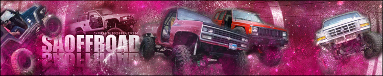
I don't think of pink when I think of offroading lol - just my opinion. It looks alright. The only things I would suggest are to bring the text out a little more. Make it stand out and pop. I would also change the background to look more like a dirt/desert look instead of looking like the trucks are floating in outerspace

__________________
Quote:

|
||
|
#3
06-27-2010, 04:49 PM
|
|||
|
Yeah sadly im not digging it either. Like Edge said, needs something more 'off road' if thats what the site is for. Also Im not a fan of that many trucks. Maybe just concentrate on one or two closeups, It's difficult to blend that many images into a background effectively,
__________________
 Quote:
|
||
|
#4
06-27-2010, 08:42 PM
|
||
|
Yeah i dont want to include a bunch of trucks and have been thinking about removing the white ford to the right, maybe just inlarge the green jeep and the 2 in the center and spread it out across and increase the font as well as change the background....
so much work lol... ill give it another go and post up for more C&C
|
|
|
#5
06-27-2010, 08:59 PM
|
||
|
By the way, should i change the background to look like a desert, or leave it grungy with brushes?
Edit, after staring at it and moving this and that i really dont know where to go with it... Last edited by the þrox™; 06-27-2010 at 09:17 PM.
|
|
|
#6
06-28-2010, 10:55 AM
|
|||
|
Here are a few pictures I pulled up to help you.
http://image.fourwheeler.com/f/15373...rack_roost.jpg http://image.4wheeloffroad.com/f/102...usty_track.jpg http://image.fourwheeler.com/f/17165...view_track.jpg
__________________
Quote:
|
||
|
#9
06-28-2010, 08:59 PM
|
||||
|
Quote:
__________________
Quote:
|
|||
|
#10
06-28-2010, 11:13 PM
|
||
|
http://www.saoffroad.com/forums/home.php
For further clarity, this website is not a big corporate run site, infact the current banner is an old one i made. The website is a group of those who like and enjoy 4-wheeling locally. Looking at some tutorials and what i want to do with the help you've given me im going to create something with a background like this. Most of the banners i've made for this website where based off photos and not a grunge background, but i just got stuck on the grunge design and havent explored much else. I found some tut's on photomanpulation and have fallen in love. This background i made took 5 minutes, its extremely ROUGH and just a springboard for more ideas. What do you think? Good start? 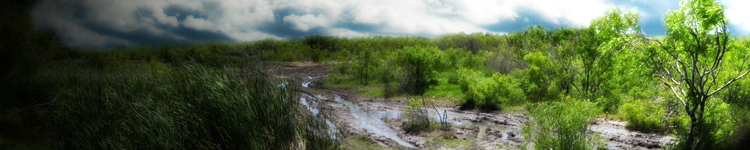
|
|
|
#11
06-28-2010, 11:36 PM
|
|||
|
It's a good start. I would, however, suggest that since the forum and portal aren't a fixed width that you setup the banner to be capable of expanding in width to the left or the right. Take for example a forum skin for NHQ, say Brown. The copper tubes in the middle of the banner are capable of repeating on the X axis.
Designing the banner to be capable of doing this would be a huge plus, in my opinion, because then it would bring the body and the banner of the page together more seamlessly. With the way it is designed now, you have two huge gaps of empty space on both the left and right sides of the banner. It throws the whole site off.
__________________
Quote:
|
||
|
#13
06-29-2010, 08:24 PM
|
|||
|
Quote:
__________________
 04' Dodge SRT-4, Mopar Stage 3, 406whp/436wtq
|
||
|
#14
06-29-2010, 10:23 PM
|
||
|
Reworked the background a bit and added a truck, i wanted to add more but i just couldnt make it look right with more vehicles.
Currently im stuggling with a good text style to use...any suggestions? 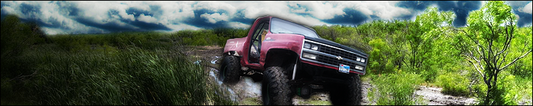
|
|
|
#15
06-29-2010, 10:36 PM
|
|||
|
Now see, that looks 100 times better. I would go with a steel type text on the left hand side.
__________________
Quote:
|
||
|
#16
06-30-2010, 01:38 AM
|
|||||
|
Quote:

__________________
    Click here for the official member status images!     Quote:
|
||||
|
#17
06-30-2010, 03:40 AM
|
||||
|
Quote:
__________________
Quote:
|
|||
|
#18
06-30-2010, 10:11 PM
|
||
|
Thanks guys, i love it as well.
Funny thing, i changed the colors of the original banner because the members of the offroading site didnt like the second one that i have been working on here because it looks "too photoshopped". Lmao, anyways i changed the colors of the orginal and they are going to use it, but i also added an expanding x-axis part like you suggested EDGE. Thanks for the tips, ill probably finish the banner anyways and see how it turns out. If you were wondering what the new colors were: 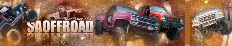
|
|
|
#19
07-02-2010, 12:33 AM
|
||
|
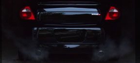
that manip looks great. go with that look, makes it more clean and professional. remove the drop shadow on the truck. your other stuff looks too old school. i think it would be cool if you had a close up of a truck grill coming at the viewer. but not sure if that would work. keep trying different stuff. post up any stuff you make. i like commenting on yalls stuff.
__________________

|
|
|
#20
07-02-2010, 05:44 PM
|
||
|
The one with the photo background looks better. Are you still going to finish it? I'd like to see how it turns out with text. BTW... expanding layouts are not always the best way to go. I usually stick to fixed width because expanding looks funny on widescreen monitors.
__________________
  
|
|
|
| Currently Active Users Viewing This Thread: 1 (0 members and 1 guests) | |
|
|
 Similar Threads
|
||||
| Thread | Thread Starter | Forum | Replies | Last Post |
| Latest work - Current it? | NaughtyPerry | Sigs and Graphics | 4 | 01-26-2005 01:41 PM |
| Latest Work C&C | the þrox™ | Sigs and Graphics | 9 | 11-07-2004 09:02 PM |
| Latest work | NaughtyPerry | Sigs and Graphics | 5 | 10-24-2004 09:48 AM |
| Latest work | _Z_ | Sigs and Graphics | 8 | 02-11-2004 06:41 PM |
| A collection of my Latest work.. | die4me | Sigs and Graphics | 2 | 07-15-2002 03:56 AM |


 Linear Mode

