|
|||||||
| Sigs and Graphics Show off your sigs/graphics or request your own |
 |
|
|
Thread Tools | Search this Thread | Display Modes |
|
#1
 02-08-2005, 06:20 PM
|
||
|
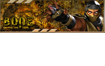
c nc please
 comments please 
|
|
|
#3
02-09-2005, 09:59 AM
|
||
|
grrrrrr.. can never get text right....
|
|
|
#4
02-09-2005, 10:19 AM
|
||
|
hmm i guess u could put a blend on it instead of a solid colour. at the mo it is a differnt colour than the rest of the sig, and the pixel text to :/
try adding text as a shade of grey instead and adding a blend. then the text will always match  depending on the shade you use and the blend mode, you may want to drop the bevel.
|
|
|
#6
02-09-2005, 12:41 PM
|
||
|
steve what do u mean a blend? in the blending optins which one???
gradient?
|
|
|
#8
02-09-2005, 02:34 PM
|
||
|
o ok nice one thnx
|
|
|
| Currently Active Users Viewing This Thread: 1 (0 members and 1 guests) | |
|
|
 Similar Threads
|
||||
| Thread | Thread Starter | Forum | Replies | Last Post |
| c nc | BdD-Ares | Sigs and Graphics | 4 | 01-06-2005 10:15 AM |


 Linear Mode

