|
|||||||
| Sigs and Graphics Show off your sigs/graphics or request your own |
| View Poll Results: Born VS Con | |||
Born---> 
|
|
3 | 14.29% |
Con----> 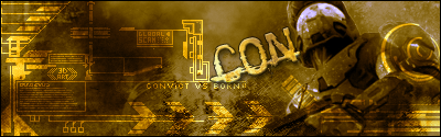
|
|
18 | 85.71% |
| Voters: 21. You may not vote on this poll | |||
 |
|
|
Thread Tools | Search this Thread | Display Modes |
|
#5
 11-22-2004, 07:46 PM
|
||
|
con
cuz thats owange 

|
|
|
#6
11-22-2004, 10:45 PM
|
||
|
Con...because, like Preparation H...on the whole, it feels good
 The visor animation thing kinda threw me off. If that wasn't there, I probably wouldn't have voted just because of indecision 
__________________

|
|
|
#7
11-23-2004, 02:19 AM
|
||
|
I gave con the 10th :P gj both of u
|
|
|
| Currently Active Users Viewing This Thread: 1 (0 members and 1 guests) | |
|
|
 Similar Threads
|
||||
| Thread | Thread Starter | Forum | Replies | Last Post |
| Born | .ringer. | Sigs and Graphics | 13 | 09-20-2005 08:05 PM |
| Born | Gfx Man | General Chat | 0 | 07-26-2005 09:34 PM |
| Con? | Stoint | Sigs and Graphics | 5 | 06-17-2005 01:50 PM |
| tried something like con | JS-AntiHero | Sigs and Graphics | 6 | 01-26-2005 07:21 AM |
| con | Born | Sigs and Graphics | 6 | 12-23-2004 12:52 PM |


 Linear Mode

