|
|||||||
| Sigs and Graphics Show off your sigs/graphics or request your own |
 |
|
|
Thread Tools | Search this Thread | Display Modes |
|
#1
 07-10-2004, 08:03 PM
|
||
|
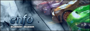
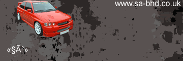
Which one do you like
Let me know which one you like or both
1.  2. 

|
|
|
#6
07-10-2004, 11:39 PM
|
||
|
yeah ringer it's just the look they give to the sig. Thanks for the comments guys. It's good to know that i'm getting better.
|
|
|
#8
07-11-2004, 03:00 AM
|
||
|
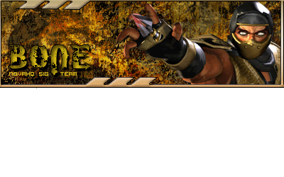
i like #1 better but i think it would look nice if you made the text kinda big in the middle and made it a little more cleaner cuz on my screen it looks choppy ( the tentacles)
|
|
|
| Currently Active Users Viewing This Thread: 1 (0 members and 1 guests) | |
|
|


 < Supporter


 more tentacles...looks good though
 the 1st looks better...monster in middle is outta place. IMHO
")
 Linear Mode

