|
|||||||
| Sigs and Graphics Show off your sigs/graphics or request your own |
 |
|
|
Thread Tools | Search this Thread | Display Modes |
|
#1
 01-30-2005, 12:05 AM
|
||
|
Heh help con out and win!
Ok im throwing a little contest here to see what you guys can do with the items provided. As you know my website http://www.silent-sceptiks.com/conscell/ is fairly old and has had the same design for quite some time know. I have recently been working on a new template for the website (a much larger one) and im looking for a little help with the banner.
Rules: Must fit within the grey border on the image. (Provided down below) Try to maintain the same colors (greenish). Theme prefered is tech, but all others are exceptible Must have the symbol/logo somewhere inside the banner. (Provided down below) TEXT: Cons Cell Slogan: (Not needed, if you would like to you can) Prize: Well as long as the template is up your banner will remain on my website http://www.silent-sceptiks.com/conscell/ which recieves roughly 20 hits a day. You will recieve full credit as the designer and have the option to join the staff. If you have your own website i will also sponser you in ads and by links for the full time the template is up. (Thats 20 hits a day that could be at your site!) The Image: http://img.photobucket.com/albums/v1...cellbanner.png The symbol/logo: http://img.photobucket.com/albums/v1...oncelllogo.png Good luck to all those who enter: Either post entries down below or email them to joeycon@gmail.com 
|
|
|
#6
01-30-2005, 03:18 PM
|
||||
|
Quote:
Quote:
|
|||
|
#8
01-30-2005, 05:05 PM
|
||
|
too bad ure site only gets 20 hits a day... ill advertize over my msn... hope it helps man its a good site
__________________
 :: Delta Force 2 Player demo: gu. tnt. unupdate: wolf. sod. da. tnt. snm. update/fv: lc. ltk. horde. loe. cs. tnt.
|
|
|
#9
01-30-2005, 06:46 PM
|
||
|
so all ppl have to make is a banner?
__________________
 ----------------------------------------------  ---------------------------------------------- []==[_'_'_'_'_']=----- <^>(O_o)<^> ----------------------------------------------
|
|
|
#10
01-30-2005, 06:58 PM
|
||
|
 if u want to make the banner save this pic and fill in the blank area and keep that black logo in it i guess if what he wants
__________________
---------------------------------------------- ---------------------------------------------- []==[_'_'_'_'_']=----- <^>(O_o)<^> ----------------------------------------------
|
|
|
#12
01-30-2005, 08:24 PM
|
||
|
well i just went ahead and made the banner...but if you would like to make one go ahead...ill still sponser you and give you the job. If it turns out to be better then mine then ill stick it up their as well. Sorry to those who already started.
|
|
|
#14
01-30-2005, 08:37 PM
|
||
|
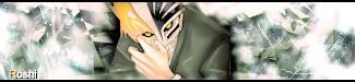
hows this look?
 i purposely didnt put a border, cuz i dint know if it would look like a 2 px when u threw it into place. also, you can just throw a 1 px on if u need it. n e ways, hope thats something like what you wanted, kept the green, and also used the only good render i've ever done , which is also in my current. tried to make it as professional as possible. what do i win? (since i dont have a site...)
__________________
-o l d e s t- 
|
|
|
#16
01-30-2005, 09:13 PM
|
||
|
hmmm the only reason i made my own banner is because i made a new symbol....so if you put the new symbol and replace the old one...ill have your banner up the first entire week of my new release. Is that good?
It is very nice though bro...i dont think anyone can beat that. I saw that you took that advice from SD.  new logo: [IMG Last edited by the þrox™; 01-30-2005 at 09:49 PM.
|
|
|
#20
01-30-2005, 09:33 PM
|
||
|
oh well i think urs is much better...
maybe lower the opacity of the white... also...i thought u wanted it 512 x 101 or w/e also, make that ur surrent sig, its about the right size, i really like it.
__________________
-o l d e s t-
|
|
|
| Currently Active Users Viewing This Thread: 1 (0 members and 1 guests) | |
|
|
 Similar Threads
|
||||
| Thread | Thread Starter | Forum | Replies | Last Post |
| heh | EDGE | Sigs and Graphics | 10 | 12-18-2004 06:06 PM |
| Heh, new. | EDGE | Sigs and Graphics | 17 | 12-15-2004 04:51 PM |
| heh | PrecisioN | Sigs and Graphics | 5 | 09-14-2004 06:55 PM |
| heh | Spazz | Sigs and Graphics | 15 | 03-05-2004 09:07 PM |
| heh | die_4_me | Humor & Jokes | 1 | 01-13-2002 05:21 PM |


 Linear Mode

