|
|||||||
| Sigs and Graphics Show off your sigs/graphics or request your own |
 |
|
|
Thread Tools | Search this Thread | Display Modes |
|
#1
 04-12-2004, 10:06 AM
|
||
|
Phoenix
__________________

|
|
|
#5
04-12-2004, 05:42 PM
|
||
|
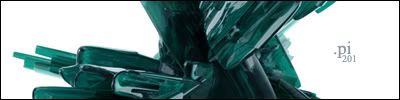
egde i saw his hosting thing and he used that same sig in different colors like 3 times but a little different andyea i dont like the font or the black part on the right. IMO
|
|
|
#6
04-12-2004, 10:24 PM
|
||
|
very nice mate, thanks ya much
|
|
|
#9
04-13-2004, 02:50 PM
|
||
|
which? I use Impact, but I modify it sometimes. try using your eraser tool but select a grunge brush for the eraser and erase some of the tex (don't go too overboard). It looks pretty stylish sometimes. Base02 can be used in some conditions
>>spazz is gonna some here and say "BASE02 IS WHORED"
|
|
|
#10
04-13-2004, 03:01 PM
|
||||
|
BASE02 IS WHORED!!!!

__________________
    Click here for the official member status images!     Quote:
|
|||
|
#12
04-13-2004, 05:32 PM
|
||
|
Base 02 is whored
i have it
|
|
|
| Currently Active Users Viewing This Thread: 1 (0 members and 1 guests) | |
|
|


 Linear Mode

