|
|||||||
| Sigs and Graphics Show off your sigs/graphics or request your own |
 |
|
|
Thread Tools | Search this Thread | Display Modes |
|
#2
 10-25-2004, 07:43 AM
|
||
|
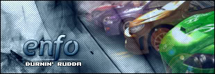
pretty cool m8, its good the way the middle is lighter then the rest, it helps the focal point
 i'm sure you could add something to the text but i'm not sure what. the font is great but i dont really like grey to much :/ 
|
|
|
#3
10-25-2004, 08:19 AM
|
||
|
nice m8ee
chg the font in corner though
|
|
|
#5
10-25-2004, 11:40 AM
|
||||
|
Quote:
__________________
 Quote:
|
|||
|
#15
10-26-2004, 07:12 AM
|
|||
|
one thing you could do if you want, is make the pixel font a bit shorter. it looks stretched to me. i usualy do mine about 5px down and 4 across
hope it helps
__________________
Quote:
|
||
|
| Currently Active Users Viewing This Thread: 1 (0 members and 1 guests) | |
|
|


 < Supporter


 redx
redx
 Linear Mode

