|
|||||||
| Sigs and Graphics Show off your sigs/graphics or request your own |
 |
|
|
Thread Tools | Search this Thread | Display Modes |
|
#2
 07-01-2006, 03:45 AM
|
|||
|
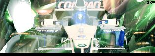
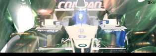
top one imo, but theres not much difference to see,
i can tell the bottom one is a big less contrasted than the top, but not by much. but yeah top one imo
__________________
 Quote:

|
||
|
#3
07-01-2006, 07:03 AM
|
||
|
First, I like it, nice.
Now that that is out of the way ...... what the hell? Everyone knows there's only one real race car: Nascar! You need to switch that car out with a #8 Budweiser chevy or a #3 Goodwrench chevy. Then that sig would be awesome. But again, nice sig. I just had to get that out of my system.
|
|
|
| Currently Active Users Viewing This Thread: 1 (0 members and 1 guests) | |
| Thread Tools | Search this Thread |
| Display Modes | |
|
|


 Linear Mode

