|
|||||||
| Sigs and Graphics Show off your sigs/graphics or request your own |
 |
|
|
Thread Tools | Search this Thread | Display Modes |
|
#2
 06-24-2005, 10:48 AM
|
||
|
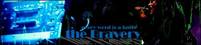
the layout is simple and effective, but the use of bevel and colors seem to throw it off for me. Maybe in verson 19 try some different colors and maybe ones not so saturated.
oh and i like the idea that you have to register to be able to see the images that seemed to spark some controver last time
__________________
 

|
|
|
#4
06-24-2005, 01:14 PM
|
||
|
always love your templates m8, this one is especialy sexy
__________________
|
|
|
#8
06-24-2005, 08:29 PM
|
||
|
thanx for the feedback. and yeah, i thought it best to avoid controversy this time.
|
|
|
| Currently Active Users Viewing This Thread: 1 (0 members and 1 guests) | |
| Thread Tools | Search this Thread |
| Display Modes | |
|
|
 Similar Threads
|
||||
| Thread | Thread Starter | Forum | Replies | Last Post |
| FAO NHQ Design team & Admins... | Terry | Sigs and Graphics | 5 | 06-20-2005 01:17 PM |
| Tried a New Design | Scattergun | Sigs and Graphics | 4 | 01-18-2005 07:18 PM |
| ‼¿ùC↑d┐ÑΣùCrÉ3a↨ | teej | Sigs and Graphics | 10 | 08-23-2004 05:07 AM |
| ¿¿,▬B7!oy╞d‼É╞C«{ | teej | Sigs and Graphics | 10 | 08-09-2004 08:03 PM |
| www.ali3nated.com - design & hosting | Shughart | Web design and Programming | 3 | 08-27-2003 05:59 PM |


 Linear Mode

