|
|||||||
| Sigs and Graphics Show off your sigs/graphics or request your own |
 |
|
|
Thread Tools | Search this Thread | Display Modes |
|
#2
 12-09-2007, 10:53 AM
|
||
|
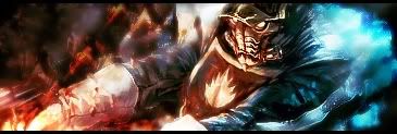
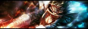
hate to boost your bubble they look the same to me.
i know they are not file name say sig76-2.jpg and sig76.jpg ok i seen one is a bet change the claw area and lower right area not the same you change the area a bet. lay on top each other: 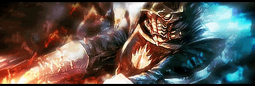 hard to tell. i go for the first one on top 1v
__________________
* altnews sources [getmo & others news] not found main FNN: realrawnews.com *Discord: Unknown77#7121 Playing now days: EA Games> swtor [star wars old republic] Last edited by Hellfighter; 12-09-2007 at 11:09 AM. 
|
|
|
#11
12-10-2007, 03:59 PM
|
||||
|
Quote:
hahaha raped Now, back to sports!
__________________
 Quote:
|
|||
|
| Currently Active Users Viewing This Thread: 1 (0 members and 1 guests) | |
|
|


 Linear Mode

