|
|||||||
| Sigs and Graphics Show off your sigs/graphics or request your own |
 |
|
|
Thread Tools | Search this Thread | Display Modes |
|
|
|
#8
 06-11-2004, 02:01 PM
|
||
|
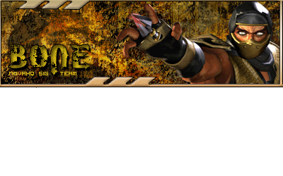
he said u need an idol and its hot steve good job needs a pic or something cuz its kinda plain


|
|
|
#9
06-11-2004, 02:57 PM
|
||||
|
looks good man
thats the style he was going for people, lighten up a little bit
__________________
    Click here for the official member status images!     Quote:
|
|||
|
#10
06-11-2004, 08:21 PM
|
||
|
its hot tho just thought some of the sig was not really needed all the black and stuff. but its still ho t

|
|
|
#13
06-12-2004, 07:37 AM
|
||
|
Looks tight
__________________
 - Where Your Thoughts Come To An End -
|
|
|
| Currently Active Users Viewing This Thread: 1 (0 members and 1 guests) | |
|
|


 Hybrid Mode
