|
Sigs and Graphics Show off your sigs/graphics or request your own |
![]() |
|
Thread Tools | Search this Thread | Display Modes |
#1
|
||
|
![]()
I think its one of my best yet.C&C
![]()
__________________
† ![]() ![]() |
#2
|
||
|
the blur is offcentre...other than that, i agree
__________________
-o l d e s t- ![]() |
#3
|
||
|
I don't like the wheels on top of the border but that is just me.
__________________
![]() ![]() ![]() ![]() |
#4
|
||
|
Definitely best yet by you...keep up the good work
![]() ![]()
__________________
![]() |
#5
|
||
|
^^^
same
__________________
![]() |
#6
|
||
|
OK
![]()
__________________
† ![]() ![]() |
#7
|
||
|
Yeah... I like the abstract background colour alot.
Oh, and by the way, those dashed lines need to be one space down ![]()
__________________
![]() ![]() ![]() ![]() |
#8
|
||
|
woo how did that happen
__________________
† ![]() ![]() |
#9
|
||
|
duh duh duh!!! DISASTER!!! lol jks.
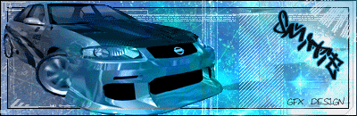
nice sig dude. im not keen on the animation and the rear wheel needs to be cut proberly. nice background otherwise ![]() |
#10
|
||
|
i thinkz is the best you've done m8, by far, n1 m8
![]() |
#11
|
||
|
ty
![]()
__________________
† ![]() ![]() |
![]() |
Currently Active Users Viewing This Thread: 1 (0 members and 1 guests) | |
|
|