Quote:
Originally Posted by varg

I think your type looks great, good choice of font, good kerning, great colorcombo and I love the subtle 3d effect added to it.
I have a problem however with the glasses.. I think you are on to something with the idea, but it isn't working very well right now. There's too much happening at the same place for me to read it well.
The reflection in the glass, highlights on the frame, tape and big eyes are just too much information. Try to get rid of some of the details, remember that the most important thing is that 1: I read and remember the name of the company 2: Understand what the company does
|
A logo is the most important image a company could ever possibly possess. The object is to make it stick it so it catches people's attention. That is what the glasses and eyes do, they stick out. What was the first thing you noticed? The glasses right? That's what I wanted you to notice and I've succeeded in that.
99% of logos out there don't convey what a company does unless a slogan is attached. My logo does not convey what my company does and I did not intend on designing it that way. As long as this image sticks to people, they will remember it. Trust me.
Say for example you looked at the pepsi logo for the first time - ever.
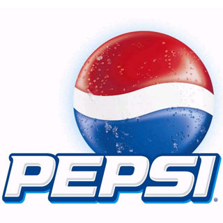
Just by looking at this, would you be able to tell it was a soft drink manufacturer? No, you wouldn't. The object of this logo was to attract the customers eyes to the sphere. It's eye-catching and its colorful.